Little Explorers
Project Overview
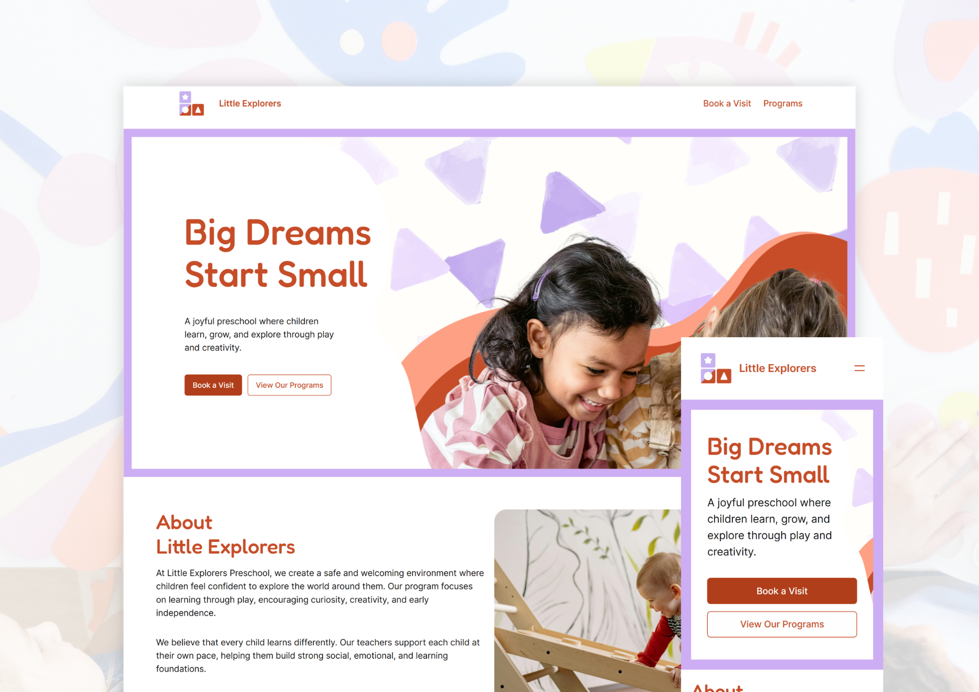
Little Explorers Preschool is a concept website designed for an early learning centre.The project focused on creating a warm, approachable digital experience that communicates the school’s values and encourages parents to enquire or book a visit. The site was built using WordPress Gutenberg, with customisation of the Twenty Twenty-Four theme to establish a distinct visual identity.
Problem
Parents choosing a preschool are making an emotionally-driven decision, not just an informational one. Many existing preschool websites fail to:
• Build immediate trust.
• Clearly communicate their learning approach.
This results in uncertainty and lower engagement.
Approach & Process
The design strategy focused on balancing emotional reassurance with clarity. Key decisions included:
• Using warm, approachable language to build trust
• Structuring content to answer parent concerns progressively
• Prioritising calls-to-action to encourage early engagement
The project followed a structured content and system design process aligned with SDLC principles. This approach emphasised speed and flexibility while maintaining a structured progression from concept to final implementation.
Planning & Requirements
Parents needs were identified, particularly around trust, clarity, and ease of enquiry. Core sections such as learning approach and testimonials were prioritised.
Design
Instead of external wireframing, layout decisions were explored directly with a template based on Gutenberg. This allowed rapid iteration of content hierarchy and section flow based on a parent’s decision-making journey.
Development
The Twenty Twenty-Four theme was customised to establish a soft, child-friendly visual identity. Typography, spacing, and colour choices were refined directly within the CMS to maintain consistency.
Testing
Sections were reviewed and adjusted to improve readability, visual clarity, and CTA visibility across the page.
Technology & Implementation
The website was developed using WordPress Gutenberg, leveraging its modular block system for flexible layout creation. The Twenty Twenty-Four theme was customised to:
• Maintain consistent typography and spacing.
• Support reusable content sections.
• Enable efficient content updates.
The block-based approach allowed rapid prototyping and refinement directly within the platform.
Tech Stack:
The visual direction uses soft colours, rounded elements, and friendly typography to reflect a nurturing environment. Design choices were intentionally simple and accessible to reduce cognitive load, maintain clarity across devices, and support readability for a broad audience.
Outcome
The final result is a clear, emotionally resonant website that aligns with the needs of its target audience.
This project demonstrates my ability to:
• Design for emotionally-driven user journeys.
• Translate brand values into visual and content decisions.
• Structure content to support conversion-focused goals.